What issue gets Minnesotans most engaged and inflamed?
The wealthiest not paying their fair share? The unaffordability of health care and child care? Proposals to deny citizens the freedom to control their bodies, marriages, and reading choices? Low-income families lacking affordable food, housing, and early education?
Nope. State flag redesign! Fetch the torches and pitchforks!
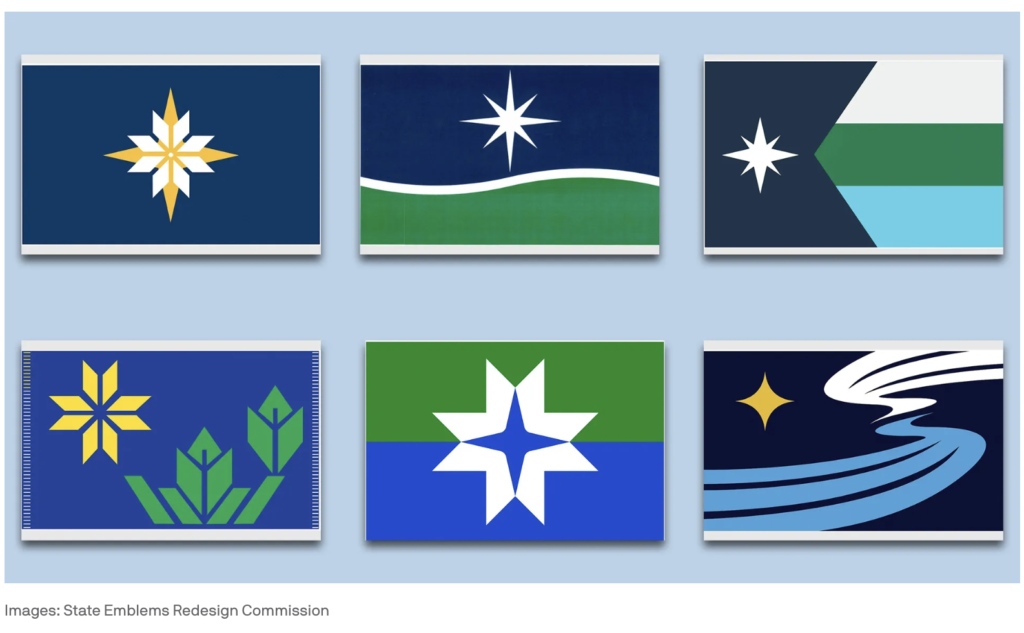
If you want to see Minnesota’s “public square” aflame, take a look at social media posts about the re-design of the Minnesota state flag. Minnesotans are passionately rising up 1) in defense of the current state flag, and/or 2) expressing outrage about the lack of their preferred colors, layouts, symbols, and words being included on the six designs that have been chosen as finalists.
“Where’s the fucking loon?”
When the Minnesota Legislature decided to redesign the current state flag, it took on a thankless political challenge. But I give them a lot of credit for taking this on, because the change is badly needed.
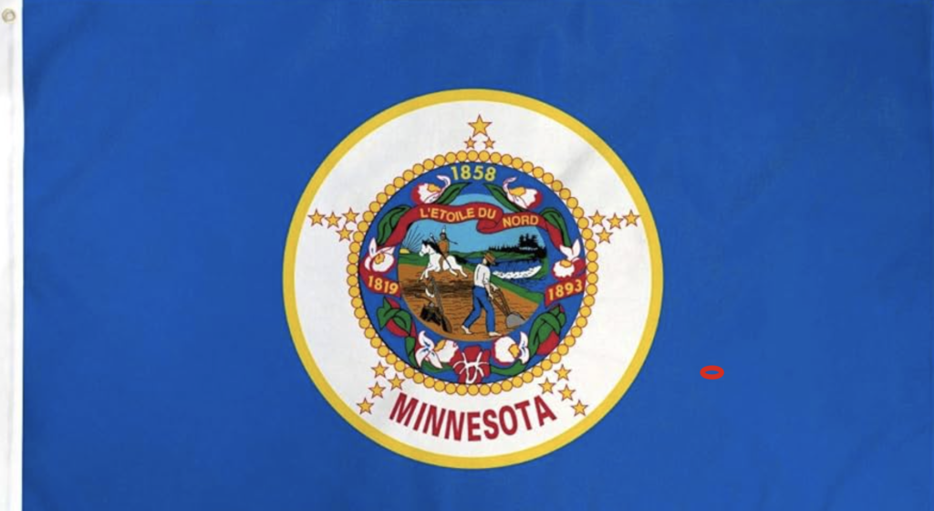
The current flag has many faults. The state seal on a plain background design is dull, illegible at a distance, and similar to many other state flags. More disturbingly, Minnesota’s current flag spotlights a white settler plowing a field as a Native American rides away on a horse, a scene that seems to glorify Minnesota’s most shameful chapter, when indigenous people were slaughtered and robbed of their land and livelihoods by white newcomers and white supremacist politicians.
Even if you disagree that the scene on the state seal glorifies mistreatment of indigenous people, you have to acknowledge that, given our history, it feels that way to many. Therefore, this is a needlessly divisive image to feature on a flag that that is supposed to unify all Minnesotans.
Moving into the future, we need a flag that is more unique and unifying. However, redesigning a flag in the age of social media is easier said than done. Anyone who works in or around graphic design won’t be surprised by the volume and temperature of the feedback being offered about Minnesota’s new flag design finalists. In the world of graphic design, this happens all the time. We are all supremely confident that we have impeccable design taste that everyone else should follow, and we’re not shy about sharing our thoughts.
However, we don’t all make the same design choices. Take a look at the artistic choices we individually make in our lives. You’ll see that there is nothing close to an aesthetic consensus amongst Minnesotans. Therefore, picking a consensus flag out of the pile of over 2,000 submissions is going to be impossible. Even the finest of designs is going to be controversial with many Minnesotans.
In addition to the “everyone thinks they’re a designer” phenomenon, we now have social media, where the masses are empowered to impulsively and repeatedly voice their opinions in the most harsh terms. In the social media age, a public relations shitshow was sure to follow the naming of these flag finalists, and it has.
So really, are these six finalists really that horrible? Or would any flag design have faced similar public brickbats?
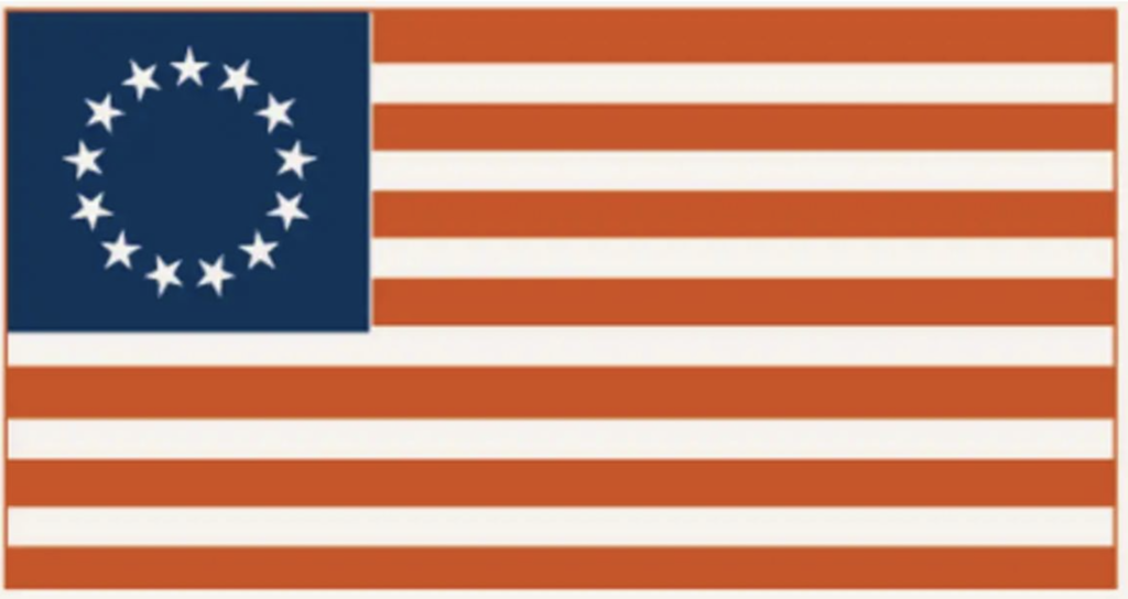
Imagine if the Internet had existed in 1776, and that George Washington had sought popular input on Betsy Ross’s flag design. Just like with the Minnesota flag designs, Betsy would have gotten an earful about her stars and stripes proposal.
“LMAO. I’m sorry, but this is reallly the best she could do?
Even I could draw that! This is so simplistic it looks like a talentless child did it!
How much did the corrupt Continental Congress pay for this monstrosity? Those founding fathers fuck up everything.
WTF do stars have to do with America anyway. And why such ugly stars?
Where’s the EAGLE? There must be at least one EAGLE!!!
WE NEED TO START OVER FROM SCRATCH!!! Here’s MY much better drawing…”
Woud it kill them to include the actual name of the country on the country’s flag?
I don’t see cotton farmers or anything else representing the south’s proud heritage here. So typical! Such disrespect! “Why is the design so vague and symbolic? This doesn’t look anything like the 13 colonies!
Why not just use that awesome Gadsen snake flag instead?!?
Before the flag fetishists go off on me, let me be clear that my point isn’t that Betsy had a bad design. My point is that any time you ask the public to weigh in on graphic design, some will inevitably pick apart any design that is offered, even one that over time ultimately becomes beloved.
Therefore, state leaders just need to approve a design and get prepared to be pummelled for a while by the self-righteous masses of wannabe graphic designers. It’s inevitable.
Legislators won’t be praised now, but history will look more kindly on them.