In 2023, DFLers in the Minnesota Legislature passed a staggering amount of significant policies to help parents, children, students, women, people of color, seniors, taxpayers, voters, and workers. In 2024, it’s time for Republicans to show what they’ve got. Up until now, they haven’t had much of a policy agenda, other than opposing all of the aforementioned DFL improvements and trying to cut taxes for the wealthiest seniors.
But buckle up, because Minnesota Republicans have a hot new culture war issue to promote. State flag preservation, baby!
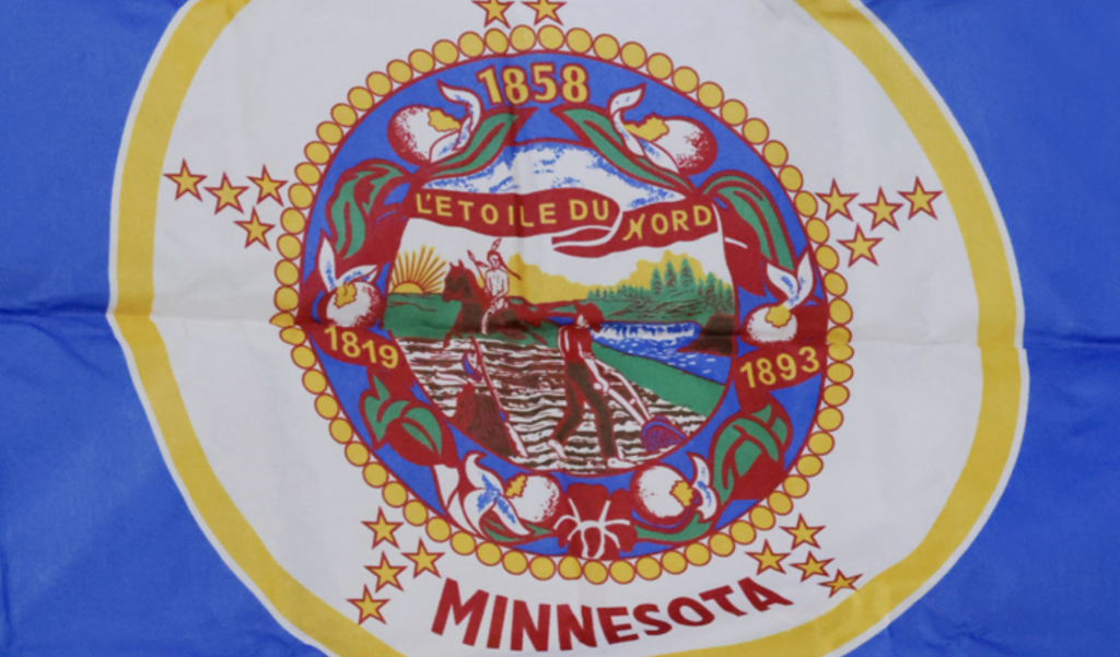
Minnesota Republicans are promising to fight like hell to preserve the current Minnesota state flag. You know, the one with the jumbled seal that looks like several other state flags. The one that is impossible to discern at a distance. The one that has long been seen by indigenous people as celebrating their subjugation and genocide. Republicans love that sucker!
The University of Minnesota’s Bill Lendeke explains the troubling origin story of the current flag, which features a picture of a white pioneer plowing a field with a rifle next to him while a Native American rides away with the sun setting:
The (state flag) designer’s wife, Mary Eastman, even penned a short poem to explain what was on the seal:
Give way, give way, young warrior,
Thou and thy steed give way;
Rest not, though lingers on the hills
The red sun’s parting ray.
The rock bluff and prairie land
The white man claims them nowEastman’s rhyme has the benefit of honestly reflecting the dominant feelings of white Minnesotans at the time, most of whom wanted to eradicate Native Americans from their homeland. As such, the seal and flag represent sentiments that led directly to the genocide of Dakota people, and is one that Minnesotans should not celebrate in any way.
Despite this dark history, Republicans seem to see themselves as fighting to preserve a righteous flag, not unlike the brave soldiers at Iwa Jima in Joe Rosenthal’s iconic photo.
The state Republican Party even created a Save The Flag website to hock sweet t-shirts suitable for MAGA rallies.

Needless to say, Republicans look nearly as ugly in this fight as when they fight to preserve statues celebrating white supremacists such as Nathan Bedford Forest, Robert E. Lee, and John C. Calhoun.
To be clear, no flag redesign was ever going to be universally loved. When it comes to matters of design, everyone has different tastes and biases. And plenty of folks who preferred one of the other more than 2,600 designs considered by the State Emblems Redesign Commission are understandably still feeling tender.
But most of us who didn’t get our top choices respect the process and don’t throw a hissy fit over it
Given that we’re never going to have a unanimous opinion on flags, we have to look at the big picture: The current flag celebrates race-based dominance, and that’s just not ok. Beyond that, flag design experts have long said that Minnesota has one of the very worst state flag designs.
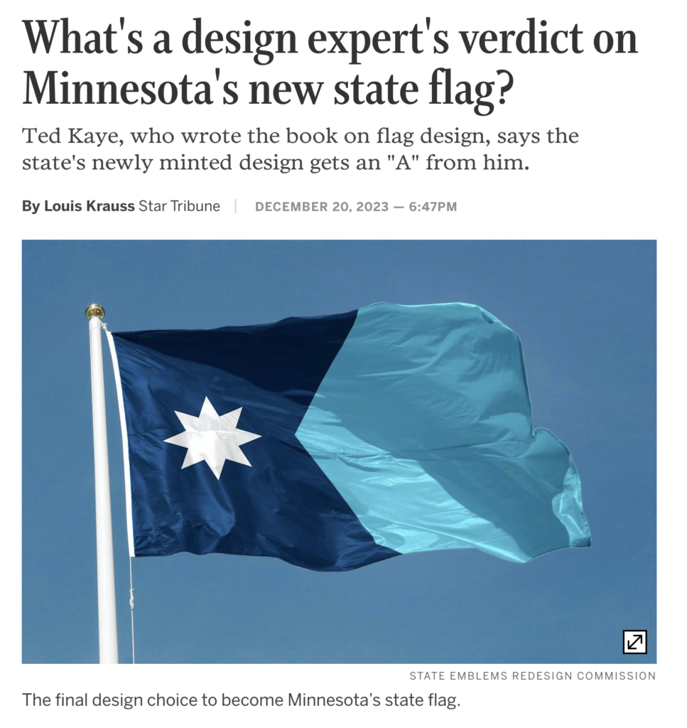
The Commission’s recommended design fixes both of those problems.
Ted Kaye, who wrote the 2006 guidebook “‘Good’ Flag, ‘Bad’ Flag,” gave Minnesota’s new design an “A” and called it excellent.
“You can’t make everybody happy, but Minnesota will come to be extremely proud of this flag,” said Kaye, secretary of the North American Vexillological Association (NAVA). “The state has seized a wonderful opportunity to improve its symbolism.”
He said he believes it would rank in the top 10 among the states and provinces of the United States and Canada were NAVA members and the public to be surveyed.
I hope the Minnesota Legislature doesn’t waste much time on the state flag debate. It’s clear what it should do.
The Commission went through a painstakingly thorough and thoughtful process, so the Legislature should quickly, decisively, and proudly approve the recommended new state flag. It is a huge improvement over the ugly — in so many ways — flag that has been poorly representing Minnesota for far too long.
Our old state flag was so foolish and uninspired–embarrassing, really–that it was a REPUBLICAN State Senator, Ed Oliver of Deephaven, who sponsored a bill to re-design the flag, over 20 years ago! (Pioneer Press, March 27, 2002.)
The new state flag design is simply an anonymous yawner–it’s sterile in its superficial symbolism, and visually dull–it’s virtually monochromatic. Yes, it’s better than the old design–but then, ANYTHING would be.
The 1893 flag design placed the state seal in the center, surrounded with a surfeit of symbolism and decorations (stars, flowers, ribbons, fringe.) It was two-sided–white and blue. [Oregon still uses a two-sided state flag.] The 1893 design was altered later, maybe in the 1950’s, at least to the extent of only using the blue background. Some of the minor decorative details were modified then as well, I believe.
That old flag was so foolish and uninspired–embarrassing, really–that it was a REPUBLICAN State Senator, Ed Oliver of Deephaven, who sponsored a bill to re-design the flag, over 20 years ago! (Pioneer Press, March 27, 2002.)
The 1945 Legislative Manual states that the territorial legislature originally voted for a seal that would portray “an every-day scene, consisting of an Indian family with their lodge, canoe, etc., and a single white man visiting them, with no other protection than the feeling of hospitality and friendship existing between the two people. The white man is receiving from the Indian the pipe of peace.”
The 1945 Manual says: “That seal was authorized by law but never used.”
When the egregiously different design came back from the engraver, replete with a misspelled Latin word in it, “. . . it was ridiculed by journalists as representing ‘a scared white man and an astonished Indian,'” and “. . . a man plowing one way and looking another.”
But subsequent to statehood in 1858, the territorial seal’s unauthorized artwork was perpetuated in the state seal, only adorned with a French motto, not a Latin one.
Picking up on the original territorial suggestion of a “peace pipe” could have commemorated Minnesota’s pipestone quarry, a renowned Indigenous cultural landmark. However, Oklahoma’s state flag already features a “peace pipe,” so the idea’s now been used.
Many Minnesotans wanted a loon image in the flag design. The new state seal, which is an excellent emblem, both graphically and symbolically, does depict a loon. Why not follow through on our flag?
There’d be sense and symmetry to it. Minnesota is placed at the headwaters of the Mississippi river, which is a main migratory bird flyway; and down at the other end, the Louisiana state flag proudly features their state’s heraldic bird, the pelican.
A loon on Minnesota’s banner would symbolically connect the Mississippi’s start and finish with two popular mascots. It’s objected that loons don’t nest in every single Minnesota county, but all of us know what they look like and what they sound like–whereas not one Minnesotan in ten, I think, could point out the North Star in the night sky–in fact, half the people of our state never see the stars at all because of urban light pollution. To claim that the white blotch on the new flag stands for the “North Star State” is fatuous, for it stirs no emotion and connotes no sentimental associations.
We’re not even the northernmost state anymore; and the polar star neither evokes in us a popular sense of affection or identification, nor does it have any practical use now for navigation or anything else. Furthermore, it already appears on the Alaskan flag, in its celestial context and with much more relevance.
Or, as was proposed by a schoolgirl some decades ago, use another state symbol (with ecological connotations and inherent pictorial appeal), the showy ladyslipper flower, featured against a maroon field (background.) 26 state flags are predominantly blue, 5 mainly white, a few red or gold or green–none maroon.
The new flag design is disappointing. The legislature owes it to the people to be willing to try again, and to adopt a bipartisan spirit for the job.
I think most Minnesotans would prefer that a new flag design not become the basis of yet another ideological quarrel between benighted reactionaries and blinkered “progressives.”
The Republicans should admit that the old oddball flag and seal were best set aside; but they’re so intoxicated now on high-octane bigotry that they won’t do so. The DFL-ers should realize that whether the new design is “excellent” in one self-appointed expert’s opinion is quite beside the point (“de gustibus non est disputandum” as my mom used to remind us), and stop being afraid to let the people of the state have the final decision. Back to the drawing boards–and then put it up to a plebiscite!
We could have 100 design selection processes structured 100 different ways, and at the end of each process, we would always have a sizable number of vocal folks saying this:
“The recommended approach used colors A and B, but why didn’t the morons pick colors C and D?”
“The recommended approach stressed design principle E, but why didn’t the morons stress design principle F?”
“The recommended approach featured symbol X, but why didn’t the morons feature symbol Z?”
No loons. I love them, but with the way climate change is going, they’ll be gone soon, and then we’d have to change the flag again!
Good point.
https://phys.org/news/2019-10-loons-minnesota-due-climate.html
Not everyone knows about Cleek’s Law, but it does so much to explain today’s world:
“Today’s conservatism is the opposite of what liberals want today, updated daily.”
https://www.urbandictionary.com/define.php?term=cleek%27s%20law
I love the new flag!
And I love Cleek’s Law…now that I know about it! As dependable as Newton’s law of gravity.
Thank you, Joe, for digging more into the background of the current flag. The poem says it all and is an extremely persuasive piece that I hope can get to the Star Tribune’s editorial page. Tx for what you and Brian are doing!
Thanks for the comments and for reading us!
Joe. You’re on a roll, 3 posts in 2 days! The current state flag needed to be updated. Republicans are in so much chaos they are definitely grasping for straws.
By the way, I’m jealous of your EV.
Yeah, I guess I have a lot on my mind lately. Hope you’re well!
I apologize for the duplication of a section of my overlong comment that was posted previously. Of course it’s impossible to please everybody, but my disappointment with the new flag design is not just my personal crankiness. Dost thou dispute the substance of my critical description? Re-read my comments and reflect. Compare other state/provincial banners. Best ones are Alaska, Arizona, S. Carolina, Maryland, New Mexico, Quebec, Colorado, Texas. A StarTrib reader mentioned the strong resemblance the new design bears to the package of a commercial cigarette brand.
I would indeed suggest a new attempt is in order. Enough interest exists so that any expense could be defrayed by voluntary donations, sparing the taxpayers.
The clumsiness of design-by-committee is proverbial. We shouldn’t be so conceited as to think MN is any exception. But if the powers-that-be-for-the-time-being refuse to go back to the drawing board, then the spirit of democracy and the principle of “vox populi vox dei” should at least compel them to arrange a plebiscite whereby the voters can have the final word on approval or disapproval. What’s the objection to THAT proposal?
And if, for whatever reason, a Loon won’t fly on our flag, there’s a terrifically appealing design (it informally rated 2nd in a contest about 20 years ago) that consists of a Ladyslipper blossom against a maroon background. Simple, pretty, “organic” symbolism–conventional (but not so ubiquitous as to seem trite), and refreshingly NON-abstract, NON-geometrically-generated–which would be a lot more well-received, I bet. Blue, blue, blue–half the state flags are blue! None others are maroon. We could have a flag of distinction & beauty, not blah and blue.
In any event, the people ought to be the ones to ultimately decide.
If design by committee is problematic, and I certainly agree that it is, then design by 3.2 million Minnesota voters seems much more problematic.
At least the State Emblems Redesign Commission sat through dozens of hours expert input and comparative analysis, something that wouldn’t inform me or the other 3.2 million voters.
I don’t think a statewide vote would lead to a better decision, but perhaps it would help avoid a civil war?
P.S. WCCO-TV: “”While Republicans are going to be talking about this, I am going to be building roads, bridges and water treatment plants,” (Gov. Tim) Walz said. “While Republicans talking about this, I am going to be making sure our kids are eating and we’re creating job creation. So they can debate it in the legislature, we will see where it goes, but I think any time change comes, I think, a lot of Minnesotans, when they look, our flag looks like 19 other states.”
Speaker of the Minnesota House of Representatives Melissa Hortman released a statement late Monday afternoon saying, “We changed the flag for a reason. In addition to it being a poor design, it was offensive to a large number of people. There will not be the votes to delay, reverse or put the flag to a referendum.”
https://www.cbsnews.com/minnesota/news/gov-tim-walz-responds-to-republican-criticisms-of-new-state-flag/
good