 Minnesota is blessed with talented, thought-provoking policy researchers and analysts. Some of my favorites are at Minnesota 2020, Minnesota Growth and Justice, Minnesota Citizens for Tax Justice, Minnesota Management and Budget, Minnesota Revenue and Minnesota State Demographic Center, among many others.
But too few Minnesotans know about their best work. It breaks my wonky little heart that so much of their analysis gets consumed by dust mites instead of citizens and policymakers.
So, I have advice for them: Tithe to a graphic designer.
I’m not kidding. Policy analysts who want to remain relevant in a fast changing world need to set aside something like 10% of their research and communications budget to pay a talented graphic designer to crystallize their research findings in a series of visually rich snapshots, sometimes called infographics.
Why would a serious research organization invest in such “fluff?” So more people become informed by their research and analysis.
Researchers and analysts like text, numbers and girth. Graphs and tables also are used, but they are usually constructed in a way that is more complex than most viewers will tolerate. Often, a policy analyst will also drop in a few stock photos that characterize the general subject matter, such as a photo of a train in a report about transit.
But that’s not what I’m talking about here. I’m talking about pieces where bold graphics, illustrations, symbols and headlines quickly tell the gist of the most important findings at-a-glance. Examples can be viewed here and here.
Wonks often assume that their responsibility for communicating ends with the final footnote in their official report. But research shows that text-based communications alone aren’t an adequate convey the information to busy audiences. For a number of reasons, visuals are necessary:
- VISUALS ARE MORE COMPELLING. People follow directions 323% better when illustrations accompany text. Moreover, significantly more people are persuaded by presentations accompanied by visuals than by presentations lacking visuals.
- VISUALS ARE MORE BITE-SIZED. Human brains can process and absorb the meaning of a symbol in 250 milliseconds. That kind of speed matters to busy people seeking short-cuts to manage massive amounts of information coming at them.
- VISUALS ARE MORE MEMORABLE. Our brains remember only about 10% of what they hear and 20% of what they read, but they remember 80% of what they see and do. As they say in the advertising world, visuals are more “sticky.”
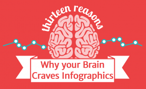 How do I know about this research? From a 60-second visit to a Googleable infographic about infographics, of course. That’s the way we do it in the latter half of 2013.
The other critically important reason to invest heavily in graphic design is:
- VISUALS ARE SHAREABLE. In a world that is increasingly shaped by social media-based information-sharing, infographics are constantly shared. At the same time, lengthy reports rarely get shared, and usually get ignored when they are shared. If an organization wants to be a bigger part of the billions of conversations happening in social media, they need to be producing quickly digestible visual summaries of their research findings.
So Minnesota wonks, visualize this: Reduce your spending on paper, binding, ink, snail mail, gatherings, collateral materials and media relations. Use the savings to invest in something that will make your work a lot more relevant — a long-term partnership between your analysts and an infographics artist.
– Loveland
Note: This post was also featured in Politics in Minnesota’s “Best of the Blogs.”
No lo contendre. Strong and constructive critique, Joe, and when you’re right, your’re right. We at Growth & Justice resolve to do better at showing and not just telling.
That will make a great organization even greater, Dane. Growth and Justice especially has a lot of terrific analysis to be crystallizing in a visual way.